

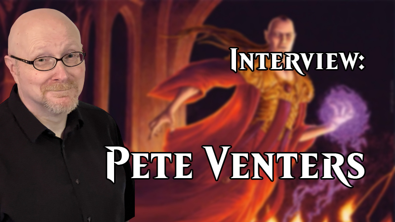
Magic: The Gathering artist Pete Venters joins Magic Untapped for a Q&A.
From the first Magic: The Gathering cards in 1993 to the upcoming Commander Legends set that releases later this week, Pete Venters has helped create some of the most unique and iconic Magic art to date. During his time with the game, he has helped to create Magic's Creative Department and even served as the game's continuity manager for a time.
With such a storied career at WotC and a being such huge force behind how Magic has been shaped over the years, Magic Untapped was honored to interview Seattle's Pete Venters.
Magic Untapped: What inspirations and influences in your life drove you to becoming a professional artist?
Pete Venters: I don't think I ever made the choice to become a professional artist, my life just kind of pointed me in that direction. I was a sickly kid bedridden with asthma, so I read a lot of comics. This led to drawing comics throughout my teens and eventually being published in a few comics, including some Judge Dredd, before accidentally meeting Wizards. I had intended to follow a career in comic books but being part of early Magic was quite simply life-changing.
MU: You're credited with having quite the role in developing Magic: The Gathering's creative department and even acting as the game's Continuity Manager from the sets Homelands through Exodus. What was that experience like and, looking back, how do you think you did with it all?
PV: Well, I'm a stickler for detail which is why I want to correct one thing in your question. I worked in the Continuity Department from Alliances to Urza's Saga. I'm not sure where the whole "to Exodus" thing came from but I know the Wiki still propagates that.
To clarify my role, I did a continuity edit pass on the Homelands story as a favor. My first real job working in the Continuity Department was presenting my concept of a flooded Terisiare for Alliances. I think I gained the title Continuity Manager around the time of Tempest when the group tasked with world-building grew significantly and we started producing style guides.
The last set I worked on in-house was Urza's Saga. I remember being really excited to finally do something with Urza and I was the person that came up with the idea that each color represented a different time and place in Urza's life. The character was simply too important to Magic to limit his role in the set to one point in time. Amusingly, I got a lot of pushback from R&D who didn't like the idea that the colors represented different points in history. They felt it didn't make sense, but given this is a game where merfolk can block knights on horseback, that complaint didn't have... legs.
My time working in Continuity was a chaotically busy time. It was three years that when I think back feels more like ten because of all the things we got done. When the job was good, it was great, and when it was bad, it was a nightmare.
How did I do? Well, I was part of the teams that built the process for art descriptions, card naming and flavor text, and I also got to build Dominaria. The fact that I came out the other end still mostly sane says I did pretty okay. But how was the quality of what we did? Well, we had some stumbles with pushing more cohesive stories front and center in the card expansions but given that players still look back at those sets with fondness, I think we must have been doing something right.
BTW, anyone want to go correct that Wiki? I feel weird doing it myself.
MU: Your artwork has appeared on cards throughout Magic's history such as on the Legends card The Abyss in June of 1994 to Pithing Needle in 2005's Saviors of Kamigawa and even more since. Which have been the most challenging for you and which have been the most enjoyable?
PV: Coming from a comic book background, I like characters with plenty of backstory so Summon Legend cards are easily the most enjoyable cards to paint: Baron Sengir, Raksha Golden Cub, Arcum Daggson, [and] Zur. They were all great fun.
The most challenging pieces are usually when I've tried something new or something with tricky light sources and it fights me all the way. Those can be heartbreaking experiences because the process draaaaags, and a lot of the time you can see the reality of the piece chipping away at what you hoped it would be. If there's time, it can be better to start over, but deadlines don't always allow that luxury.
Also, blue cards are my bane. I think the very best blue spells benefit from wild, non-representational approaches. Something weird and mind-bending. I just don't feel mine ever quite get there.
MU: Was there any one blue card that was challenging for you?
PV: I had to go look at my Gatherer listing for this to jog my memory. Syncopate was problematic but that's because it was originally called Dissipate and the art description called for the fireballs to turn to steam. That's not the easiest thing to imbue with any dynamism and I think the image suffered for it.
But looking back through all my blue cards, I don't see one standout example. I just find that my blue cards are more often ones that fell short of what I was envisioning. They have a higher percentage of "meh" for me.
MU: Have you ever tried a more "out of the box" approach to a card where you try a new perspective or style?
PV: Well, I've often tried to make things interesting with perspective with varying degrees of success. It can be tricky to be really outlandish in the very small space of a card image and have it read well. On the Unhinged card Zzzyxas Abyss, it was my idea to add the overhead shot of the Baron to accentuate that the image box was a deep drop and the text box was the ledge.
As for different styles, I've just never had the knack. I see artists that can switch between a variety of styles and they make it terribly jealous. My pieces seem to pretty much come out looking like me.
MU: Almost exactly 25 years ago, you created one of the most iconic pieces of classic MTG artwork in the Homelands card Baron Sengir. Now, with the upcoming release of Commander Legends, Magic players will get to experience the Baron all over again. How did the opportunity to do a whole new Baron Sengir come about and what has it been like re-imagining such an iconic character and card art?
PV: I chased that opportunity down. I saw the preview of the new Baron when it was released last year and so I contacted Wizards to see if it'd be possible to do an alt art version for the set. That window had been missed, so I asked if it was feasible to do it as a pre-release card and I got lucky.
Returning to the Baron didn't seem wildly unusual. I've never stopped drawing him as he's one of a handful of very regular requests I get for sketches. When coming at the new piece, I had to stick to the new outfit but I also could elaborate on some of the details only hinted at in Bastien's rendering. I also went with an interior scene to differentiate it from the set's version.
It's a pity I couldn't have done the Baron as a vertical piece where the lower half of the image was seen through one of the translucent text boxes. That would have given me more of an opportunity to focus on the figure and less on the surroundings, but hey, I had fun adding sixty plus skulls. Maybe not the smartest idea when on a deadline though...
MU: Do you have a favorite art medium? If so, does it make fantasy artwork harder or easier to create?
PV: I enjoy acrylics (which most of my Magic work was created in) and I enjoy digital (though it was never a faster process for me than traditional painting). But in terms of what just gives me a kick while working in it, the black and tonal washes done with marker pens for my high-end artist proof sketches are my favorites.
I'd love to try oils but I've got to find a way around my sensitivity to how damn smelly they are.
MU: What kinds of things are more tricky for you to create (landscapes, people creatures, etc.)?
PV: Buildings. No matter how much reference I have, I just don't like how my buildings look. I don't know if it's the way I approach detail, or the proportions of elements within a structure. I wish I knew.
I mean, even Castle Sengir looks goofy... but it's meant to. The castle was originally a dwarven fortress before the Baron overlaid his aesthetic onto it (by forcing the dwarves to build what he wanted). It's an ugly collision of tastes.
MU: Thanks to COVID-19, Magic organized play -- including the popular MagicFests/Grand Prix events -- have been cancelled until further notice with the last one here in the States being in Reno, Nevada, this past winter. You've been a common guest at such events. Do you miss them or are you glad not to have to travel so much?
PV: Well, I don't miss the actual travel. The flurry of to-do items before flying are always stressful, let alone the general discomfort of most airports.
However, I loved arriving. I miss those shows, I miss catching up with friends (both Magic artists and fans alike) and frankly, the life of a freelance artist can be pretty solitary. It's awesome to reconnect with people. I look forward to the shows returning but I expect they'll feel very different for some time to come yet.
MU: Is there any one Grand Prix/MagicFest memory that really stands out to you?
PV: Without a doubt, Grand Prix [Las] Vegas 2015. That was the year with the 9,200 player event and 30 artists. The atmosphere was electric. Players were psyched for the incredibly big event and the largest number of Magic artists (to date) in one place.
The other thing that made it awesome was the very different artist booth set up they had. We were set up in units of five artists in a row, with another five behind us facing the other way. Essentially a big rectangle of ten artists. Usually at shows, while working, it's usually only possible to chat with the one other artist sharing the booth with you. In this case, I could talk to the artists either side of me and the one directly behind me. That gave the event a very social feel to it. It was an event.
The rectangles could also be completely closed off allowing everyone in that unit to go to lunch simultaneously with minimal personnel needed to watch the giant booth. There were three of those booths at the show. Or maybe it was eight artists to a booth and there were four booths... I'm not sure, because artists rarely get the luxury of walking the floor during showtime.
One other thing; the line of booths crossed the middle of the room rather than being tucked up against a wall. It was nice to be in the middle of things for a change. And thankfully no really loud speakers were pointed at us.
MU: Was there any kind of card you wanted to do art for but never did?
PV: Oh, plenty. I never did an angel card, for example. I also turned down doing Squee's card as I had arranged with the [art director] to do Tahngarth and I didn't want to be greedy. Of course, when the Tahngarth card came around, the AD had changed and I missed that opportunity too. That was a disappointment.
But the card I really wish I'd been assigned was a basic land mountain. A number of people playing Pete Venters decks, particularly goblin ones, would ask when I was going to do a mountain. I asked Wizards several times but never got assigned one.
Planeswalker cards are something else I've never done, and my only printed mythic rare is a reprint of Arcum Daggson. Which is a blue card. Go figure.
Thank you to Pete for participating in this interview.


