

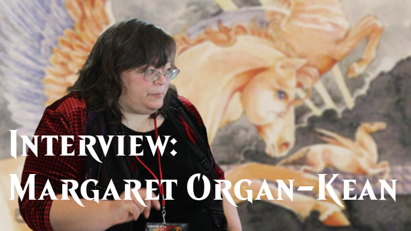
Magic: The Gathering artist Margaret Organ-Kean joins Magic Untapped for a Q&A.
After graduating from the University of Washington, artist Margaret Organ-Kean decided to do what any other fantasy artist would do in the early 1990s: attend Worldcon. Much like many early Magic: The Gathering artists, her unique, world-blended, mosaic-lain artwork was seen by the right people at Wizards of the Coast and Margaret soon became a staple artist for Magic for many years.
Magic Untapped sat down with Margaret and asked her about her artwork, her time during Magic: The Gathering's early days, and (of course) those three-toed horses known as hipparions.
Magic Untapped: What inspirations and influences in your life drove you to becoming a professional artist?
Margaret Organ-Kean: I don’t think I was driven; I drove myself and picked up hitch-hikers along the way. About the earliest one I remember was Lotte Reiniger, a German animated who created “Prince Achmed” the earliest extant animated feature, pre-dating “Snow White”. I didn’t see “Prince Achmed” until I was in my thirties, but she also created some fairy-tale shorts for the BBC and Telecasting America. My local PBS station broadcast those in the mid-to-late 1960s and I fell in love with them. It also didn’t hurt that my parents supplied me with gobs of paper and art materials, including a tube watercolor set before I was 10. I could always work on doing better.
After that there’s a bit of a lull until I was about 16, when I saw a postcard with a Kay Nielsen illustration from “East of the Sun West of the Moon”. The local library had a copy of the book with most of the illustrations still in it. From there on, I kept looking for more information on him and soon found that he’d been influenced by Japanese Ukiyo-e paintings and prints. I also found Edmund duLac and Harry Clarke, two other illustrators from the early part of 20th century. I have managed to collect books illustrated by both of them. DuLac worked in watercolor mostly, while Harry Clarke worked in pen and ink, watercolor, and stained glass.
As to becoming a professional artist - I found out people would pay me for doing what I like best!
MU: As one of Magic: The Gathering's first female artists, what has the experience been like for you?
MOK: I think of myself as one of the early artists, not one of the first female artists. When I was working, WotC and art directors treated women the same as men and the experience was quite good. After I quit working on Magic, I really can’t say how things were. I did notice that the ratio of women artists dropped by quite a lot.
MU: Would you like to see more female artists get picked up by WotC? How do you feel they've been doing to encourage more female artists over the years?
MOK: From about 1997 to recently, as far as I can tell, they didn’t purchase work from female artists very much. Lately they seem to have been using more women. I couldn’t say for sure, as I really haven’t paid attention.
MU: How did you get into doing artwork for Magic: The Gathering? Did you reach out to Wizards of the Coast or did they reach out to you?
MOK: I was at the 1993 Worldcon in San Francisco in the dealer’s room and they had a huge endcap booth. I asked my husband, “Who mortgaged their house?” At that point, WotC was not a company with enough money or products to justify a booth that big. We went over to see our first Magic cards. I wish I’d bought some! Now, since this was in 1993, color reproduction was very expensive. When I saw the cards, I thought to myself, “If I did some of these, I bet I could get a number of the cards with my work on them real cheap and use them in my portfolios.”
So when I got home, I sent the art director at WotC a portfolio. (Pro tip - never give stuff other than your business card to art directors at a convention. It won’t make it home with them. Always send it to them after the convention. These days of course, I send them something with a link to my online portfolio on it.) About three months later, I got a phone call from the art director at WotC, who assigned me three pieces for Antiquities. He didn’t offer much in the way of money, and although there were royalties I’ve always figured they were pie in the sky (I’m almost always right on that!) and - Ta-Dum! - 50 cards of each of my design. Honestly, I would have done it for the 50 cards.
MU: How long do you typically spend on a piece?
MOK: That’s a question that doesn’t actually mean anything for me. The length of time varies with the usual factors being size and complexity. As an estimate, I usually figure I paint about a 2.5” x2.5” square in an hour. Roughly. So, if you take that out to a 8” x 10” size, that’s about 12 hours, a little more. Those are very rough figures. They are in line with the only piece I’ve ever done in one sitting, Lion’s Eye Diamond, which took from 8:00 pm to 8:00 am one night. It was going so very well; I didn’t want to quit. That’s total time I’m actually working. Sometimes, if it’s a personal piece I’ll put it aside for several months (or several years) while I think about it, because I’ve hit a sticking point. Of course, if it’s a deadline piece, I just bull though, but I’m not convinced that’s the best way to get a really good painting.
MU: In your artwork, you’ve often put beautiful tile mosaics and frames into the art’s background such as with the artwork on Spore Flower, Foxfire, and Lion’s Eye Diamond. Tell us a bit about your artistic style and what such an artistic choice achieves for the finished piece.
MOK: Um, it fills space? I don’t use patterns just in the background. I use them on the subjects too, when the opportunity presents. I like patterns and I like designing them. However when I use them in the background I have a number of reasons for doing that. I don’t hold with the common notion dating to the Renaissance that a painting is a window and that you should see in a painting what you’d see looking out a window. I think that’s not completely honest. Paintings are flat. One way I reinforce my notion of the flatness of paintings is to flatten the background with patterns and borders.
Some of my influences are Persian and Mughal miniatures, Irish book painting, and Northwest Coast tribal art. Those are all styles with a heavy emphasis on what I think of as pattern. And last, but certainly not least, I am influenced by fabric arts. Fabric ornamentation is often repeating patterns. Quilts (especially traditional American quilts) are often tiled patterns. My mother designed and quilted quilts. I loved them but I have no skill with fabric. It never does what I want it to, it feels like. So in some ways the tiles, patterns and borders in my work area my answer to my mother’s art.
MU: You’ve done the artwork on many Magic cards. Which of your cards have been your favorites and what is it about them that makes them stand out?
MOK: My favorite cards are Hipparion (5th Edition), Implements of Sacrifice, and Mana Prism. Hipparion is my favorite. I depicted the hipparions accurately. They are a horse cousin with with three toes and earlier this year I received a compliment from a Harvard paleontologist on how neat it was that the hipparions looked like hipparions. I was quite chuffed. I came up with a neat expression of the instant of summoning. Since the original card was from Ice Age I depicted the animals jumping from summer to winter, and as they do, their coats change colors like several of the Arctic animals do. I really have no idea if they actually did this. As a formal artwork, I love the colors. They’re bright and lively. I think the composition and design come through well when reduced to a small size, too.
MU: Have you ever tried a more "out of the box" approach to a card where you try a new perspective or style?
MOK: I did once, on some [Legend of the] Five Rings cards. It was based on a style reminiscent of Japanese Ukiyo-e prints. The next art director asked me to use my standard style. It’s sort of disappointing in a way. I’ve really stayed with my standard style since then, although in the last two or three years, I started working in graphite. It’s close to the standard style but it’s monochrome.
MU: Since your artwork first appeared on a Magic card with the Antiquities cards Amulet of Kroog, Ivory Tower, and Martyrs of Korlis, MTG artwork has changed and evolved quite a bit. What are your thoughts on the game’s current art direction and, given the chance, are there things you would do differently with contemporary Magic: The Gathering art?
MOK: I think a number of the more recent cards I’ve seen have been amazingly beautiful. My overall impression is that they’re trying for a house look, much much more so than they did at the beginning. I’ve always thought the house look was a mistake. It’s great if you like the house look, but if you don’t there’s nothing there for you. I feel the cards would have a greater appeal to more people if there were more styles. On the other hand they’re still selling lots of cards, so they’re doing something right!
MU: What kinds of things are more tricky for you to create (landscapes, people creatures, etc.)?
MOK: I have to think more and use more reference when working on machines and landscapes. I enjoy working with them though, because I have to pay attention to what I’m doing and I can’t just skate.
MU: What are current and future projects you're working on?
MOK: Remodeling my house?
I’ve been working on some paintings that are about childhood things such as nursery rhymes (How Far to Babyon, I Had a Little Nut Tree, There Was a Little Girl) and I’ve been working on a series of cards that I call Useful Cards, because you can use them for things, such as bookmarks, marker cards, idea generators, whatever. The cards are only a dollar and I sell them when I’m at shows.
I got the idea for Useful Cards when a collector who wanted to buy my last Lion’s Eye Diamonds ask me if I was sure these were the last of them? I said no, I couldn’t be sure, I’d used them as bookmarks, and to make notes on, etc. He was incredulous. But I was right. I found a couple in some books, and one or two more when I went through my husband’s desk after he died. So anyway, I thought at the time, Why shouldn’t I use them? They’re Useful! Some people have asked why I didn’t just go through my books and find them. I went though my books this summer, reorganizing my library. It took a good thirty-plus hours over two weeks to accomplish this, and despite getting rid of around a third of them, I still have about two thousand, best guess.
Thank you to Margaret for participating in this interview.


